P&R Desjardins
P&R Desjardins are Quebec’s leading General Contractor, specialising in greater Montreal office fit outs. Their sister company, MMR, are Quebec’s premier millworking shop. After more than a five decades fitting out some of Montreal’s most significant corporate and residential spaces, it was the perfect time to reflect this success with an updated identity and brand new website.
Studio Helm undertook an extensive market research exercise, speaking candidly with clients, architects, designers, project managers and building operators in order to better understand their clients. From these learnings, Helm worked with London research agency Radford Hannah to craft a brand positioning which informed the new brand identity.
The new wordmarks are bold and confident in their simplicity. The red “plus” symbol for P&R represents partnership; a graphic distillation of their reputation as an ally and partner to their clients. For MMR, the red “tick” promotes an artisan whose expertise goes beyond the surface.
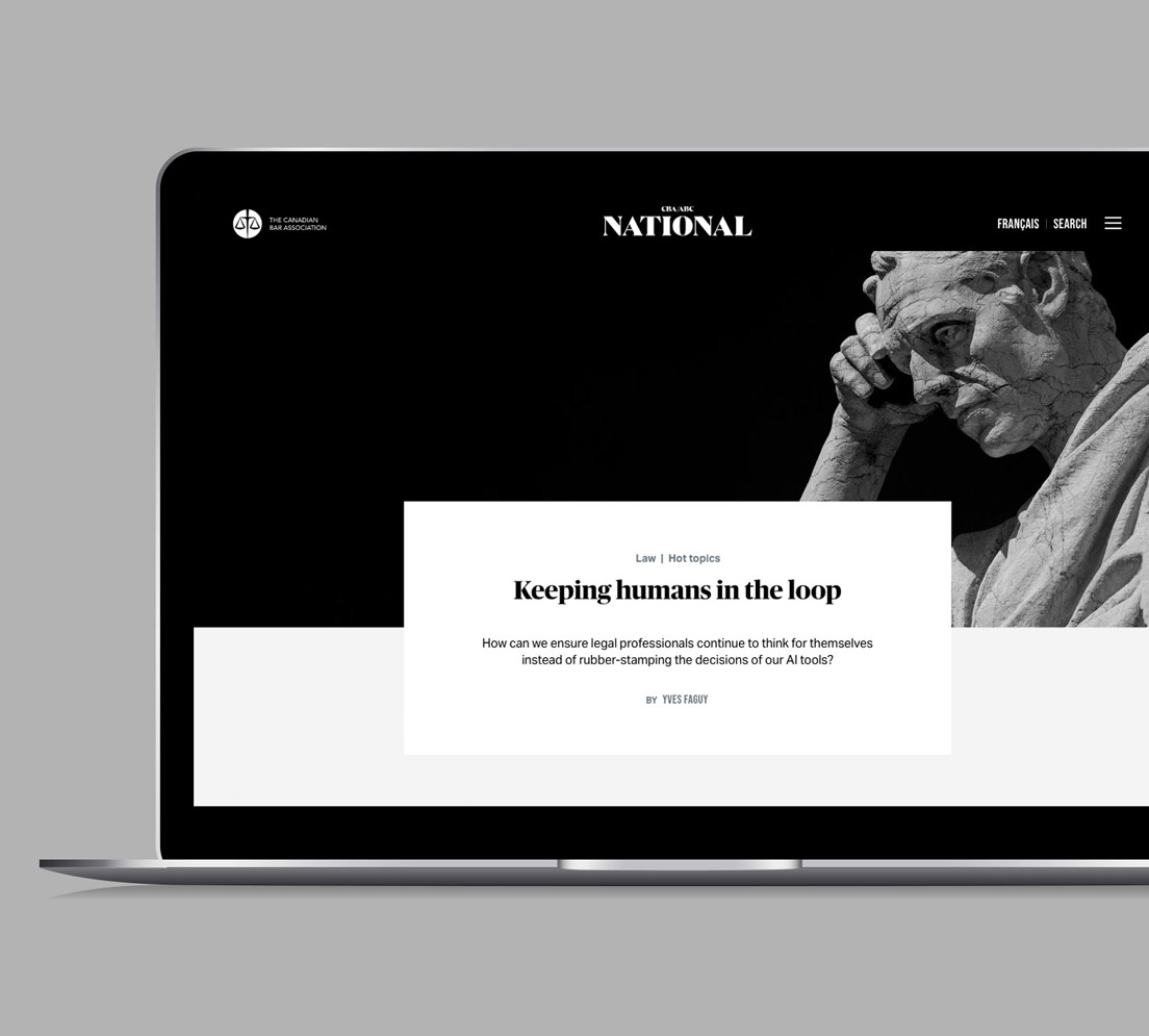
The websites for both companies showcase with greater clarity their portfolio of projects, whilst the unique “Insights” section provides in-depth commentaries on issues affecting the industry, from their own expert team. Reinforcing the collaborative aspect, there is also a useful guide to working with together so everything runs like clockwork. Helm collaborated with Montreal photographer Jazz Waheed to shoot the photography for the websites, as well as illustrators, copywriters, translators, printers and developers to bring the project together. In addition, Helm concepted and designed a full suite of print collateral, signage, uniforms, and truck graphics.
The new brand work has been received extremely positively with clients, suppliers and staff alike.
Disciplines
Brand strategy
Brand identity
Website design
Print design
Signage
Packaging
Photography
Copywriting
Art direction
Photography
Translation
Copywriting
Mary Valiakis
Illustration
Brand strategy
Radford Hannah Consulting


